

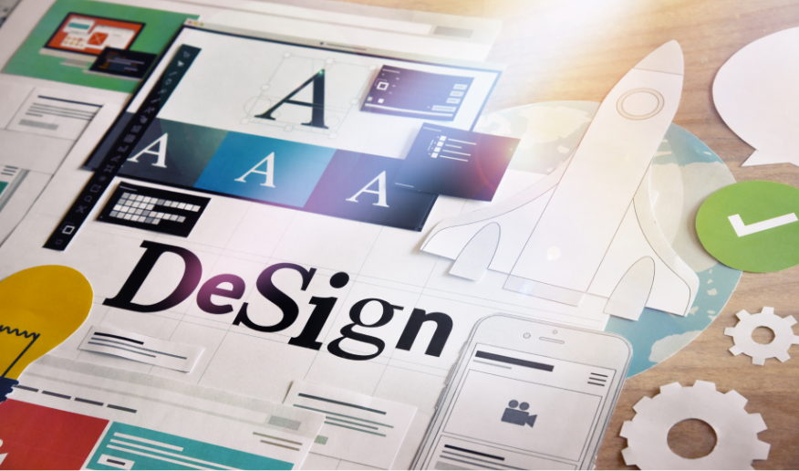
Responsive Web Design Tools and Best Practices
In an era dominated by mobile devices,
responsive design is paramount for ensuring optimal user experiences across
various screen sizes. Here's a comprehensive guide to mastering responsive
design and creating websites that adapt seamlessly to different devices:
Understanding Responsive Design
Principles: Dive into the fundamentals of
responsive design, including fluid grids, flexible images, and media queries.
Embrace a mobile-first approach to prioritize content and functionality for
smaller screens.
Implementing Flexible Layouts: Design layouts that dynamically adjust based on screen size using
CSS techniques like percentage-based widths and flexible grids. Leverage
frameworks like Bootstrap or CSS Grid to streamline the process.
Utilizing Media Queries: Employ media queries to apply specific styles based on device
characteristics such as screen width, orientation, and resolution. Optimize
typography, spacing, and navigation for different breakpoints to enhance
usability.
Testing Across Devices: Test your website thoroughly on a range of devices, including
smartphones, tablets, laptops, and desktops. Use browser developer tools and
online emulators to simulate various screen sizes and ensure consistent
performance.
Exploring Responsive Design Tools: Explore tools and frameworks like Adobe XD, Figma, and Responsive
Design Checker to streamline the responsive design process. These tools offer
features for prototyping, testing, and optimizing websites for different
devices.
By incorporating these strategies and tools
into your web design workflow, you can create responsive websites that deliver
exceptional user experiences across all devices.


Top 10 Web Design Tools for 2024
Web Design Tools
The Best Free Resources for Web Designers
Web Design Tools

Using Adobe XD for Web Design: A Comprehensive Guide
Web Design Tools

The Rise of AI in Web Design: Tools and Possibilities
Web Design Tools

Using Sketch for Web Design: Tips and Tricks
Web Design Tools

Essential Chrome Extensions for Web Designers
Web Design Tools

WordPress Themes and Plugins for Designers
Web Design Tools
Utilizing Figma for Collaborative Web Design
Web Design Tools

Leveraging Canva for Quick Web Design Mockups
Web Design Tools

Web Design Project Management Tools and Techniques
Web Design Tools
Integrating Animation in Web Design with After Effects
Web Design Tools